Painting Demonstration 1
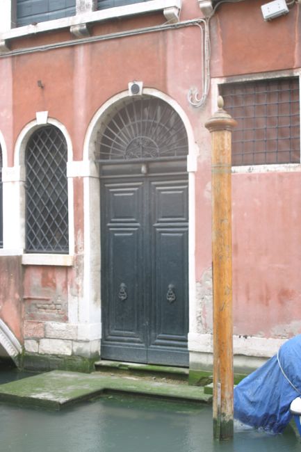
The light is flat in this photo, but I'll fix that!
Painting Demonstration 2
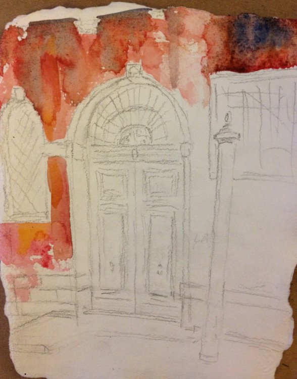
The first wash always gives you a base to build on. I wanted beautiful pinks and subtle glowing oranges in the first layer.
Work fast! I want colors to flow together. I'm building an interesting texture underneath the layers.
I make certain I have a medium dark in the first layer. This gives me something to gauge the rest of my values by.

Painting Demonstration 3
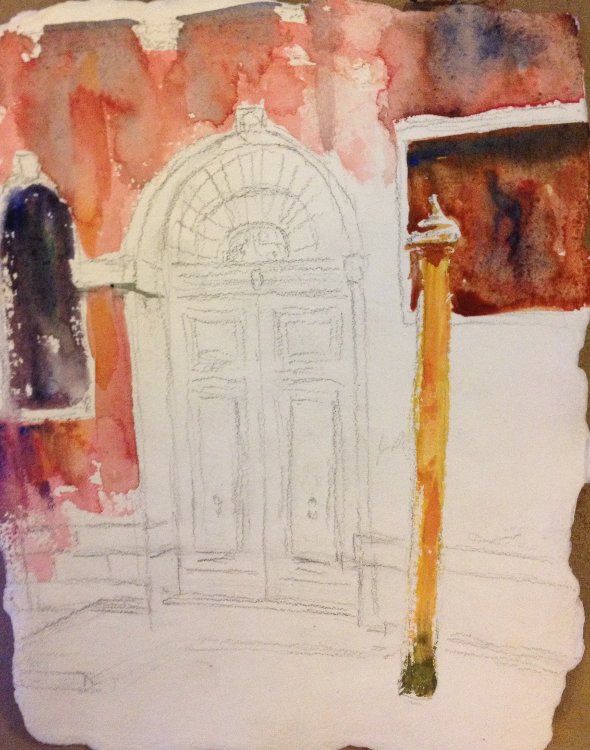
Here I'm just adding a few more darks. I drybrush the sides of the pole where the light catches it. I want to feel like it's a little sunnier than in the photo. My memories of Venice sparkle!
I'm using cobalt blue and burnt sienna for the darks. Nothing too strong.
Artist Tips
Use a combination of wet into wet wash and dry brush to give clouds volume.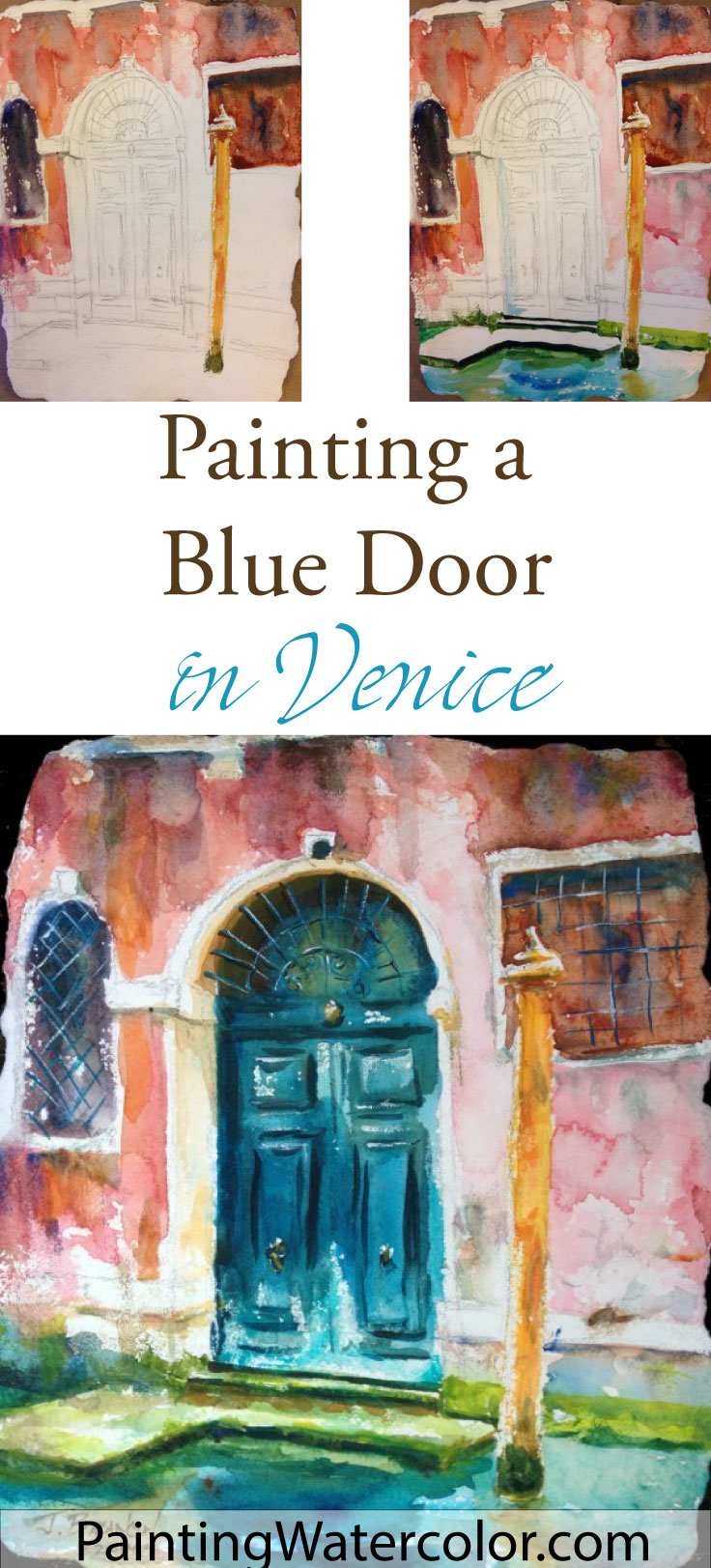
Painting Demonstration 4
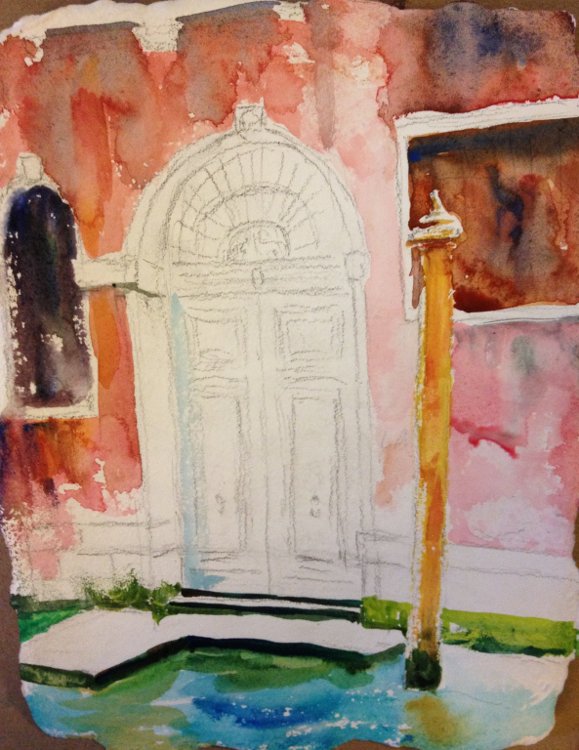
Mmm... adding some of the deep strong blues in pthalo blue and cobalt teal. Lovely strong blues – it's too bad they'll have to be toned down a bit. I'm painting the glow under the water, just like the glow under the stucco layer.
I paint the green shadows under the landing in dark dark pthalo and burnt sienna. I'll pull a little paint out later. I start the drybrush mossy texture on the lower blocks.
Painting Demonstration 5
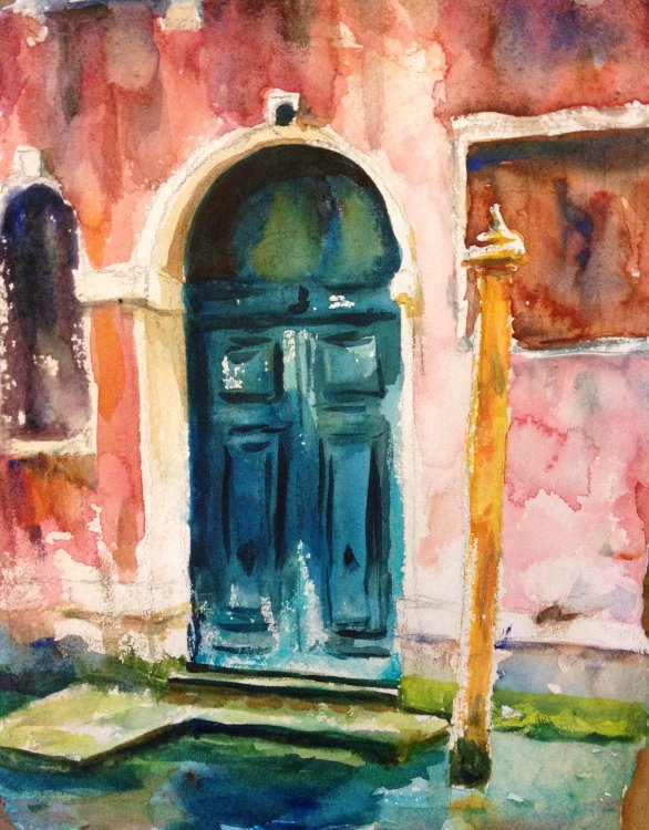
Now that I laid the base for the painting and everything is still wet in patches, it's time to really move that brush!
I do strong, rich darks on the door in pthalo blue and cobalt teal, with a touch of burnt sienna and quinacridone gold. I drybrush bits so the paper white sparkles. I'm planning on going back with a touch of white gouache so I don't worry about reserving ironwork whites.
I dash the brush around the water, letting the reflection flow.
I add more texture to the blocks and stucco with scrabbled drybrush. And just a touch of glowing gold under the step!
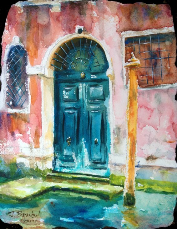
To purchase Blue Door, Venice original watercolor painting, please click!
Blue Door, Venice Final Watercolor Painting!
The color shift on the final painting is a combination of paint drying – always remember watercolor paint dries softer and lighter – and taking the photo under proper color corrected conditions. It takes a few minutes to adjust the photo so it looks just like the painting so I don't do it on the demo stages unless it's very different! As a quick guide (using a scale of 1-10), most paints will dry about 3 value and saturation levels lighter than they started. The solution is not to gob on paint, which will dull the stained glass quality of watercolor, but to build up slowly.
This painting took about an hour and a half to do. That's pretty standard for a little painting. Obviously, the individual washes can't dry in that amount of time so they have to be done a bit all over the place, wet and dry. That suits a highly textured painting beautifully!
I really enjoyed painting this watercolor. It's very simple but the scene has a lot of what I love about Venice, lovely bright colors, textures, and the wonderful light bounce glimmering from the reflecting water.